
Hello! I’m Rylie.
Apparel Designer → Product Designer
I'm a multidisciplinary designer with 8+ years across apparel and brand design, now applying that same problem-solving instinct to digital product design. Here's a look at how I think.
Apparel Sourcing Marketplace
Product Design + Research Contributions
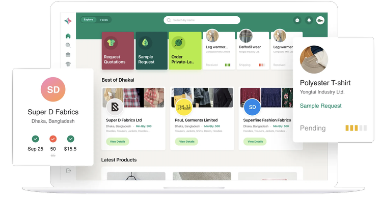
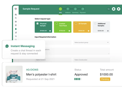
I co-founded Dhakai, an apparel sourcing marketplace connecting brands with 500+ factories. I contributed to the user journey and wireframing for our RFQ and sampling systems, tackling a core problem: decision fatigue. Brands compared a dozen factory quotes with no easy way to weigh pricing, timelines, and minimums, so I restructured the hierarchy around what usability testing showed they needed first.
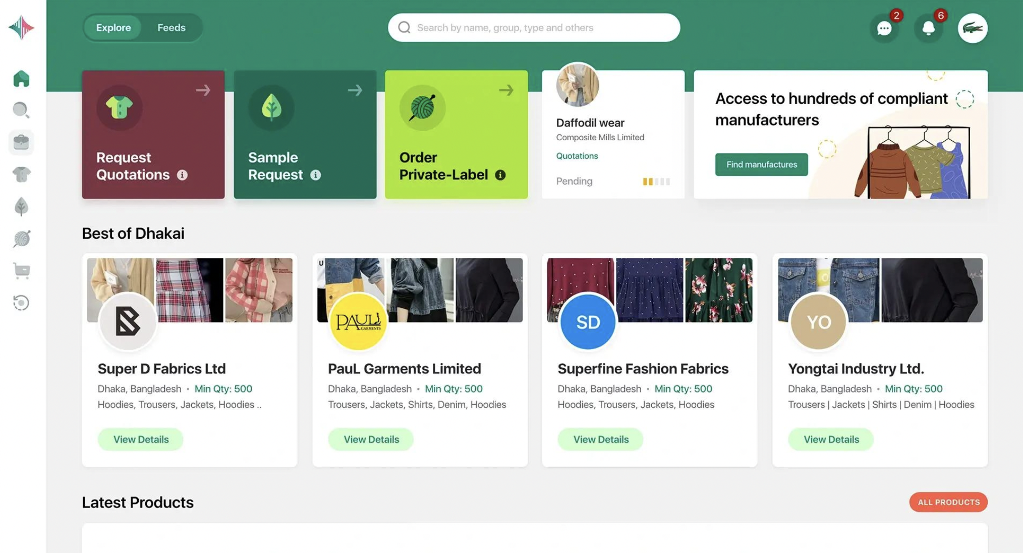
Dashboard
The hub where users see previews all activity at a glance.
Three core functions:
Initiate new orders, RFQ, sampling, or private label requests
Track pending order status
Surface trending factory profiles
Quick-view factory profiles surface the details users need to make a data-driven decision fast: location, minimum order quantity (MOQ), and product category, without requiring a click into the full profile.
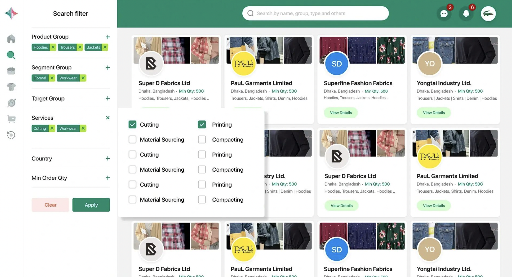
Factory Search
Narrow a catalog of 500+ factories down to the ones that actually match a brand's requirements.Search by category: Through interviews with industry professionals, I identified the criteria that mattered most when evaluating a factory: product group, industry segment, services offered, location, and minimum order quantity (MOQ).
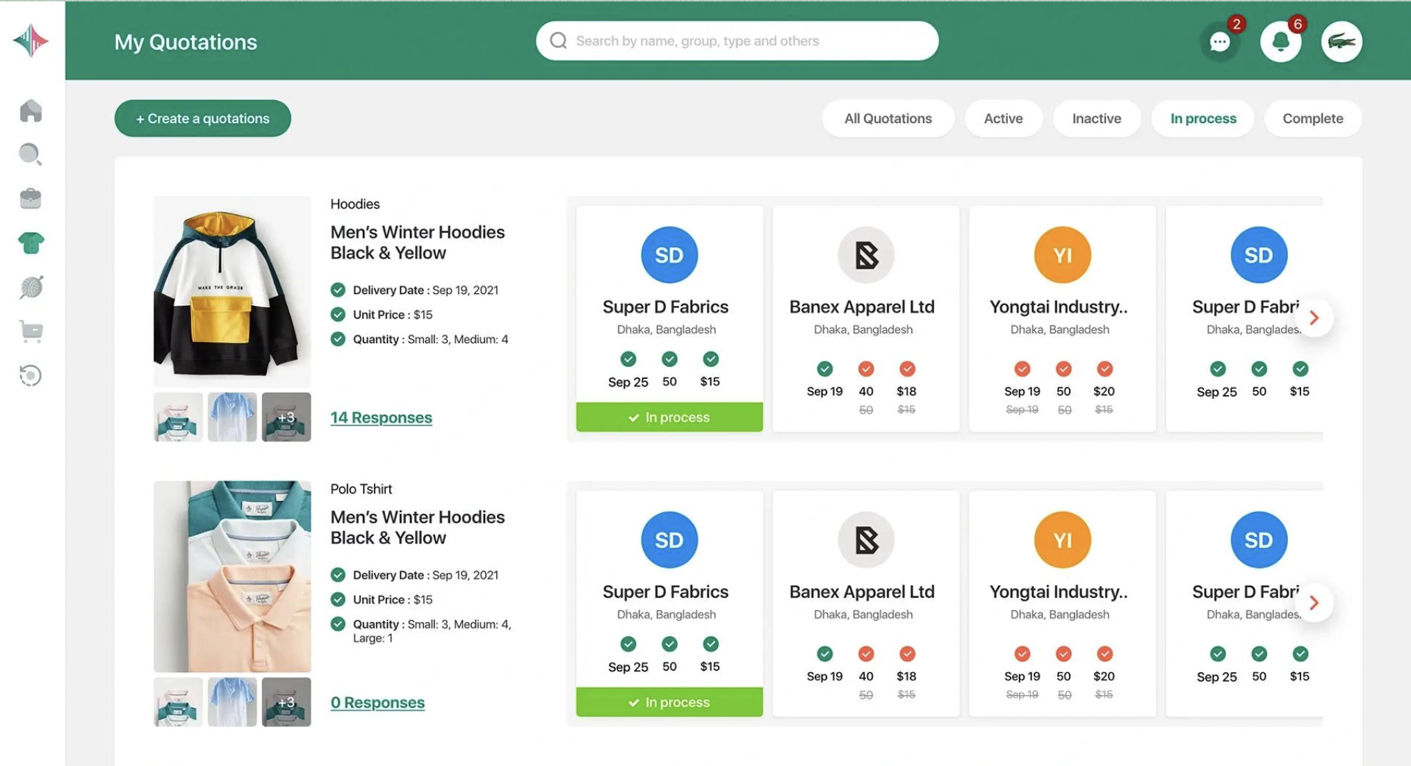
Request for Quotation
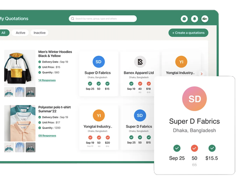
The RFQ function is a brand's first touchpoint doing business with Dhakai, designed to be clear and to the point.Brand requirements: Quickly compare a brand's submitted product requirements side by side with incoming factory responses.
Browse factory responses: See at a glance which factories meet the stated requirements, timeline, per-unit cost, and MOQ, so brands can make a data-driven decision on who to message. My first version of this layout buried the delivery date lower on the card; usability testing showed that was the first thing brands looked for, so I restructured the hierarchy to surface it immediately.
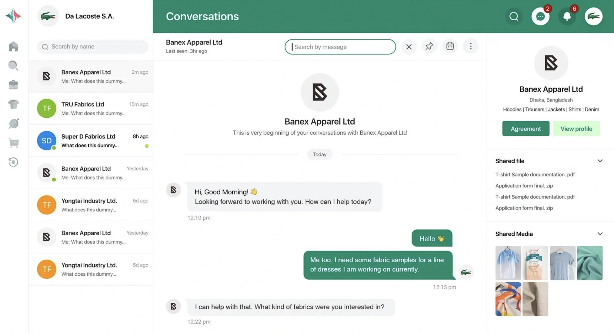
Messaging System
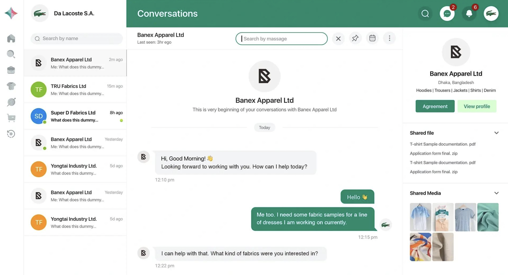
Reduce clutter and searching for messages with the categorized messaging system.Categorized instant messaging: Separate messaging threads for approved factories and new requests keep conversations organized instead of collapsing into one long, unsorted chat.
Design Analysis
Reviewing the high-fidelity mockups, I'd prioritize three revisions:2. Reduce cognitive load by anticipating user priorities. Not every option needs to be surfaced at once. Auditing each function against real user needs, and cutting what doesn't serve them, creates a leaner, more confident interface. Fewer options, better chosen, beats comprehensive but overwhelming.
3. Strengthen visual hierarchy to guide the user through the platform. Targeted adjustments to the dashboard and sampling flow would direct attention to the right information at the right moment, aligned with the chronological workflow uncovered in research. This reduces aimless navigation and the scattered feeling that comes from too many competing focal points.
1. Simplify and systematize the color library. Right now color is largely decorative. Establishing a consistent, purposeful palette, one where each color maps to a specific action or state, turns color into a functional signal rather than a stylistic choice.